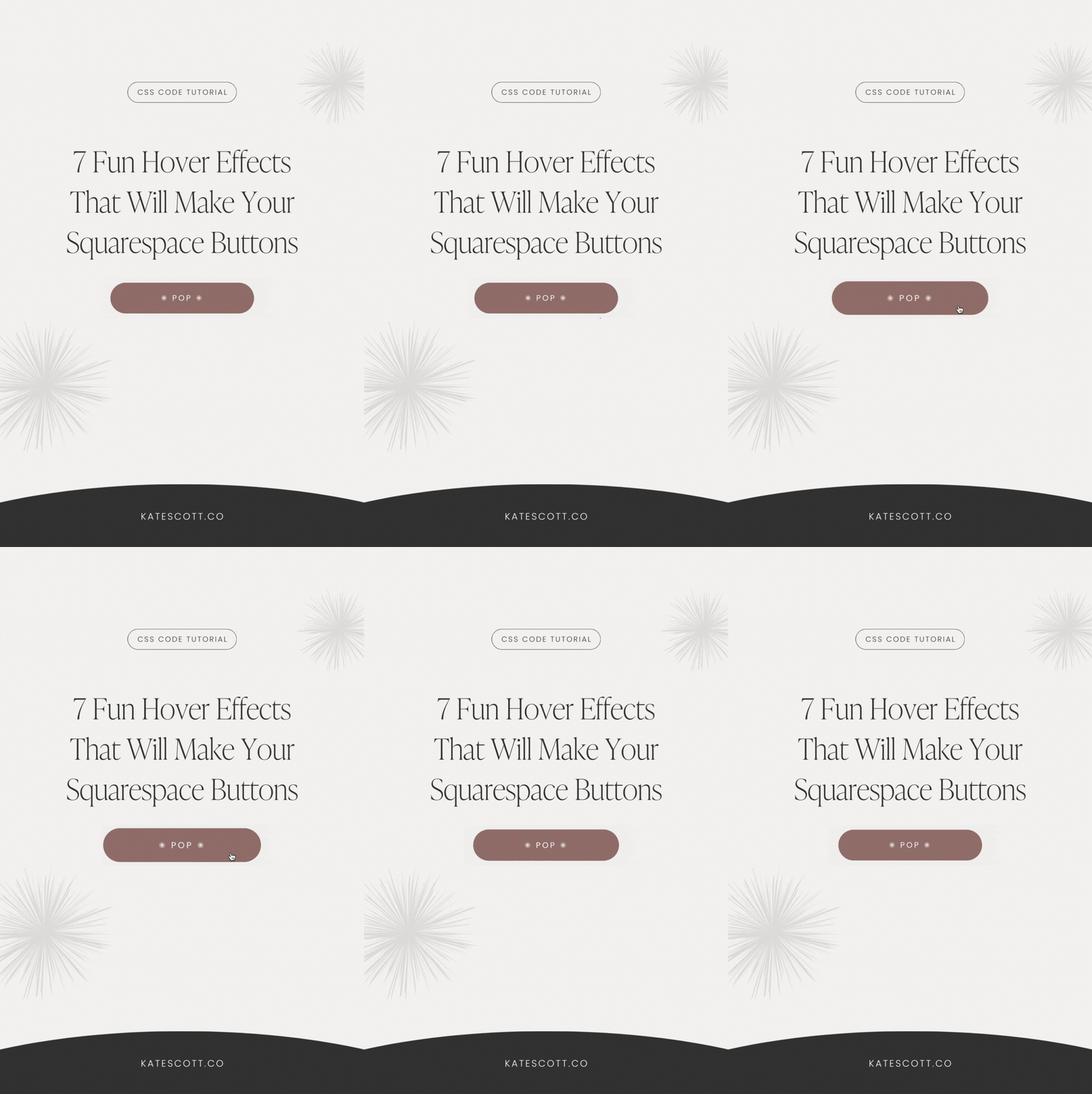
7 Fun Hover Effects That Will Make Your Squarespace Buttons Pop
Squarespace buttons have received a few styling upgrades in the last few years, but can I be honest? They’re still hella boring. Let’s spice things up with some attention-grabbing CSS hover animations for Squarespace 7.1!
Before we dive into the code, we need to customize what we can in Site Styles.
How to Change Button Color in Squarespace
Click on the Site Styles button in the upper right corner.
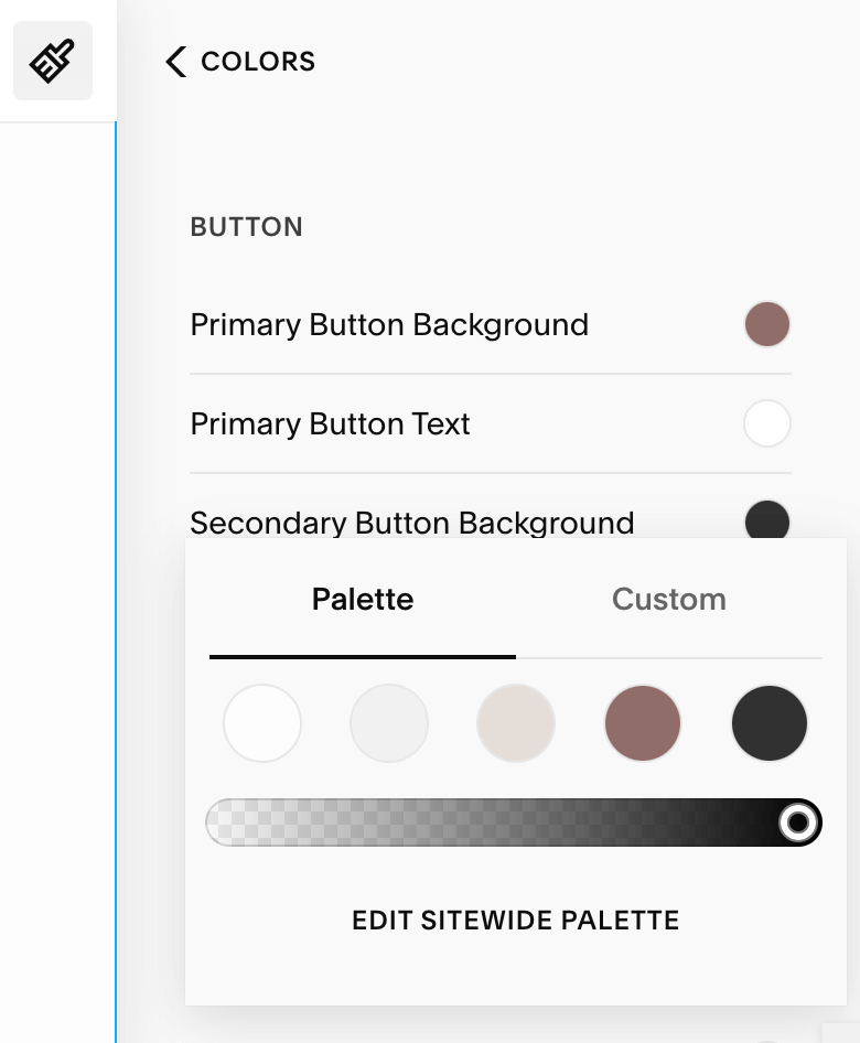
Select Colors and click on the color theme you want to edit. You can set a different button color for each color theme.
Scroll down to the “Button” section and click the color swatch to edit. You can set different colors for each button size. You can also set different background and text colors.
Enter your hex code and click the Save button in the upper left corner.
How to Change Button Font in Squarespace
Click on the Site Styles icon in the upper right corner.
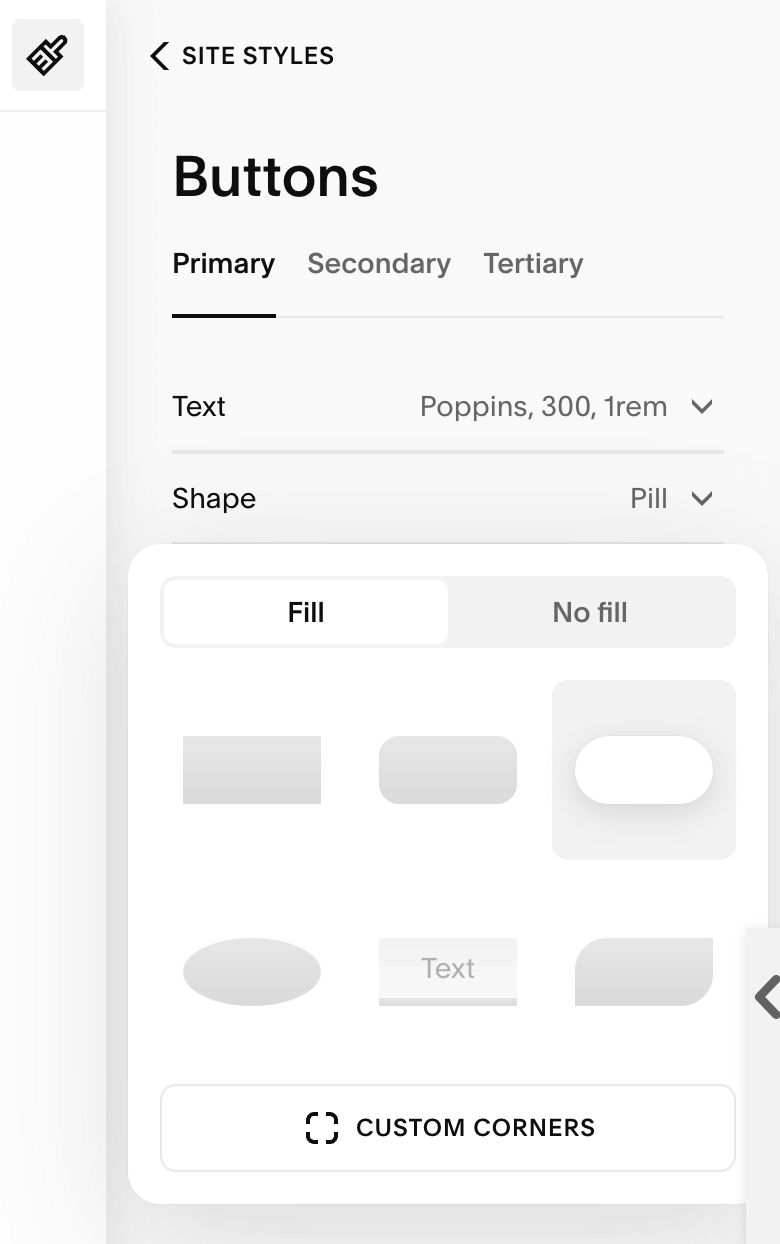
Select Buttons and click on the tab for the button size you want to edit.
Click the dropdown menu next to “Text” and click on the current font name.
Choose from the list or click Browse All Fonts for more options.
Click the little back arrow in the popup window to return to the main menu where you can change the font style, weight, size, letter spacing, and text transformation property.
How to Change Button Shape in Squarespace
Click on the Site Styles icon in the upper right corner.
Select Buttons and click on the tab for the button size you want to edit.
Click the dropdown menu next to “Shape” and make your selection.
Now we’re ready to get creative!
Here are a few things to keep in mind as you go through this tutorial:
Hover effects look amazing on desktop, but diminish user experience on touchscreens. For that reason, the code in this tutorial will not apply to mobile devices.
You can customize the code in red with your brand colors and personal style preferences.
The code targets all regular button blocks. Scroll to the bottom for instructions on how to target specific button sizes and other types of buttons, such as newsletter block buttons, form block buttons, and more.
To apply the code in this tutorial, go to Pages → Website Tools → Custom CSS. Copy and paste the code into the CSS panel and don’t forget to click Save!
Button Style #1: Knockout
The button style must be set to “fill” in the Site Styles (not the individual button settings) for this hover effect to work.
@media screen and (min-width: 992px) {
  .sqs-block-button-element {
    border: 2px solid #313131 !important;
    transition: 0.3s !important;
}

  .sqs-block-button-element:hover {
    opacity: 1 !important;
    color: #313131;
    background: transparent;
  }
}
Note that the “color” property changes the button text color. The “background” property changes the button background color. Both of these values can be customized with your brand colors.
Button Style #2: Shift
For this code to work, the button should be set to “no fill” in the Site Styles.
@media screen and (min-width: 992px) {
  .sqs-block-button-element {
    transition: 0.3s !important;
  }

  .sqs-block-button-element:hover {
    margin-left: 15px;
    opacity: 1 !important;
    background-color: transparent !important;
  }
}
Button Style #3: Shadow
For this code to work, the button must be set to “fill” in the Site Styles.
@media screen and (min-width: 992px) {
  .sqs-block-button-element {
    box-shadow: 4px 4px 0px 0px #888888;
    transition: 0.3s !important;
  }

  .sqs-block-button-element:hover {
    box-shadow: -4px -4px 0px 0px #888888;
    opacity: 1 !important;
  }
}
Button Style #4: Fill
For this hover effect, make sure the button is set to “fill” in the Site Styles.
@media screen and (min-width: 992px) {
  .sqs-block-button-element {
    border-bottom: 2px solid #515151 !important;
    transform: perspective(0px);
    background-color: transparent !important;
  }

  .sqs-block-button-element:before {
    content: "";
    position: absolute; top: 0; right: 0; bottom: 0; left: 0;
    z-index: -1;
    background: #313131;
    transform: scaleY(0);
    transform-origin: 50% 100%;
    transition: 0.4s;
  }

  .sqs-block-button-element:hover {
    color: white !important;
    border-bottom: 2px solid #313131 !important;
    opacity: 1 !important;
  }

  .sqs-block-button-element:hover:before {
    transform: scaleY(1);
  }
}
Button Style #5: Parallel
For this hover effect, make sure the button is set to “fill” in the Site Styles.
@media screen and (min-width: 992px) {
  .sqs-block-button-element {
    position: relative;
    border-top: 1px solid #313131 !important;
    border-bottom: 1px solid #313131 !important;
    background: transparent !important;
    z-index: 1;
  }

  .sqs-block-button-element:hover {
    color: white !important;
    opacity: 1 !important;
  }

  .sqs-block-button-element:after {
    content: "";
    background: #313131;
    position: absolute; top: 0; left: 0;
    z-index: -1;
    height: 100%; width: 0;
    transition: 0.4s;
  }

  .sqs-block-button-element:hover:after {
    width: 100%;
  }
}
Button Style #6: Underline
For this hover effect, make sure your button settings are set to “no fill” in the Site Styles. You’ll also want to change the padding settings on this button. Set left/right padding to 0em and top/bottom padding to 0.2em.
[SCREENSHOT]
Change the individual button settings to “fit.”
[SCREENSHOT]
@media screen and (min-width: 992px) {
  .sqs-block-button-element {
    transform: perspective(1px) translateZ(0);
  }

  .sqs-block-button-element:hover {
    opacity: 1 !important;
    background: transparent !important;
 }

  .sqs-block-button-element:before {
    content: "";
    position: absolute; right: 0; bottom: 0; left: 0;
    border-bottom: 1px solid #515151 !important;
    transition-duration: 1s;
  }

  .sqs-block-button-element:hover:before {
    right: 100%;
  }
}
Button Style #7: Grow
And finally, this hover animation can be used on any style button.
@media screen and (min-width: 992px) {
  .sqs-block-button-element {
    transition: .5s !important;
    transform: scale(1);
  }

  .sqs-block-button-element:hover {
    transform: scale(1.1);
    opacity: 1 !important;
  }
}
Target Specific Button Sizes
If you want to target a specific button size (ex. small buttons), simply amend the selector with the button size you want to target. Here’s what that looks like in practice:
.sqs-block-button-element → .sqs-block-button-element--small
.sqs-block-button-element:hover → .sqs-block-button-element--small:hover
Here are the button selectors you can use:
.sqs-block-button-element--small
.sqs-block-button-element--medium
.sqs-block-button-element--large
Counterintuitively, the primary, secondary, and tertiary buttons do not match up with the large, medium, and small selectors. Instead, the large button selector corresponds to the secondary button style. The medium button selector corresponds to the primary button style.
Target Other Types of Buttons
Squarespace uses different code to target certain types of buttons. Here are the selectors you can use to target a variety of button types. Don’t forget to check the Site Styles to set your colors and fonts for these buttons as well.
Navigation Button
.header-actions-action .btnList Section Button
.list-section-buttonList Section Card Button
.list-item-content__buttonNewsletter Block Button
.newsletter-form-button.sqs-system-buttonForm Block Button
.button.sqs-system-button.sqs-editable-buttonThat’s it, folks! Adding hover animations to your Squarespace buttons makes your call to actions bolder and more enticing. Have fun and experiment!
Please note that I am unable to respond to individual requests for Squarespace CSS help unless you are a template customer. If you would like to hire a designer to help you, see my Squarespace Designer Directory and look for designers who offer one-hour sessions.
↓ Like this post? Share it on Pinterest! ↓


