How to Select the Perfect Stock Photos for Your Website
If you can afford it, doing a full brand photoshoot with a professional photographer is the best way to get photos for your website.
So what if you can’t afford to hire a professional photographer? Or what if you need stock images to supplement the brand photos on your website?
In this post, I’m going to give you step-by-step instructions on how to pick the perfect stock photos for your website—what to look for, where to find them, and how to make changes to suit the space you’re trying to fill!
Disclosure: This post contains affiliate links. When you click on an affiliate link and make a purchase, I receive a small commission (at no additional cost to you). Affiliate links are marked with an asterisk (*).
Where to Find Stock Photos
Last year, I made a list of my top ten favorite sources of high-quality stock photos. It’s the best place to find free and affordable stock photos.
How to Choose Stock Photos
I recommend casting a wide net when you’re just starting your search. Visit a few different websites and like or save any images that feel like they could work with your brand. It doesn’t have to be exact.
Here are some things you want to look for:
Space
When considering whether or not a particular photo is a good fit, it’s important to think about where and how it’s going to be used on your website. For example, a banner image with a text overlay shouldn’t be too busy. You want the part of the image behind the text to be relatively plain and provide enough contrast.
This image will make a fine background as long as you keep the text above the flowers and use a color that provides enough contrast with the yellow wall.
You can fix a busy background image by adding a background color to the text area.
If you want to arrange an image and some text into two columns, consider how tall your text will be. If it’s a very short text area, a square or horizontal image might be appropriate. If the text area is taller, it might be better balanced by a vertical image.
Here’s an example of a short text area with a horizontal image:
Here’s an example of a tall text area with a vertical image:
I recommend planning out your website by creating a mockup in Photoshop, Adobe Illustrator, Canva, or any other graphic design program. This can help you visualize how photos will work with the space you’re trying to create.
Color
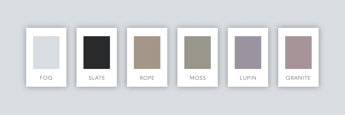
It’s important to find photos that go with your brand color palette. It doesn’t have to be exact but it shouldn’t clash either.
Here’s an example of a brand color palette I created.
Which photo do you think is a better fit?
If you said the one on the left, you’re correct. The one on the right belongs with a completely different brand.
Subject
Photos should not only match your brand colors but your brand content as well. You have a lot of flexibility here.
Let’s say you offer consulting services for entrepreneurs. Desk flatlays and mockups are definitely a safe bet. If your message is aimed toward women who want to quit their 9-5 and travel the world while working from their laptop, maybe a few strategically placed photos of tropical destinations will inspire potential clients to take the next step toward the wanderlust life.
It’s okay to be creative and think outside of the box. Just don’t think so far outside the box that your ideal clients are confused when they visit your herbal remedies website and see photos of a cute puppy instead.
How to Crop Stock Photos
Strategically cropping photos can help broaden your options depending on the space you’re working with. For example, that banner image I showed you before…
…is actually a vertical image.
The photo has a high enough resolution that I can easily fill the space of a banner image.
You can use any photo program—Apple Photos, Preview, Photoshop, Lightroom, etc. to easily crop stock photos to suit your needs.
How to Edit Stock Photos
It can be difficult to find stock photos that match your brand colors perfectly. And that’s where editing can come in handy.
This website in my portfolio was designed using 100% free stock photos from Unsplash. I had great luck finding stock photos that fit the brand aesthetic but I also had to do a bit of tweaking to achieve a uniform look with such a limited color palette.
Photoshop* is the best program for making color adjustments and I have two tricks that will solve most of your color problems.
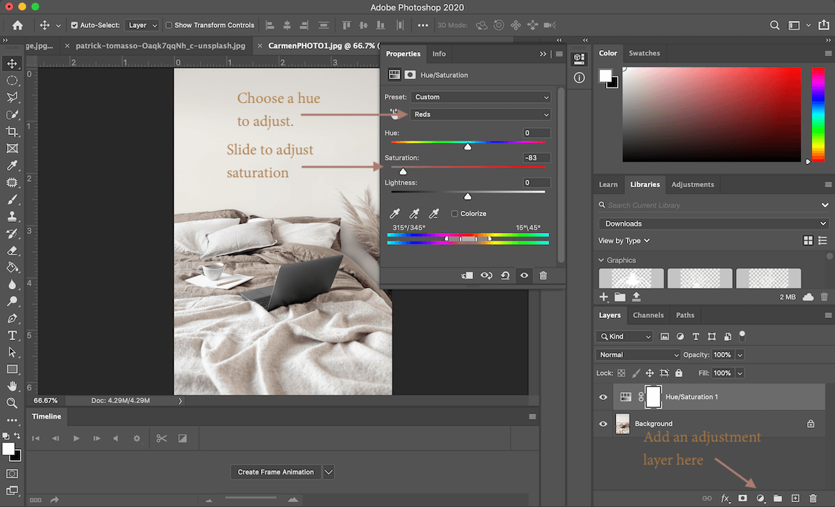
Hue/Saturation Adjustment Layer
To add a Hue/Saturation Adjustment Layer, click on the Adjustment Layer icon in the lower righthand corner of the window and then click on “Hue/Saturation…”
In this panel, you can select which colors to edit in your photo. In this example, I’ve removed most of the red tones from the photo with the click of a button.
Photo Filter Adjustment Layer
You can also adjust the color by adding a Photo Filter. To add a photo filter, click on the Adjustment Layer icon in the lower righthand corner of the screen and then click on “Photo Filter…”
Click on the color square to change the color of your filter. Sometimes neutral brand colors can make good photo filters. You can also use the slider to adjust the density of the filter.
That’s it! Selecting stock photos for your website can be a lot of fun if you know what you’re looking for. Hopefully, this guide will help make the process easier!
Have a question, comment, or want to request a specific tutorial? Drop a note in the comments below!
Like this post? Pin it on Pinterest!


