How to Customize Your Squarespace Forms with CSS
The form block is one of Squarespace’s most versatile tools. You can use it to set up a contact form, connect it to Zapier to collect email addresses for your mailing list, hack it to add cool features like file upload, and so much more.
Unfortunately, style options in the style editor are limited. Your body font will be used by default and the only thing you have control over is the color and style of the form submission button.
With just a few lines of CSS code, you can fully customize every aspect of your Squarespace form. To add the code, go to Design > Custom CSS.
This code works on both Squarespace 7.0 and 7.1 templates.
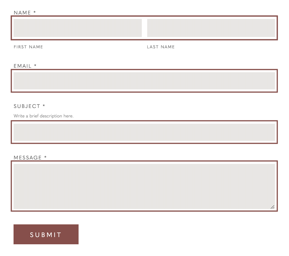
This first snippet of code controls the styling of the form wrapper text—the headings for each form field.
.form-wrapper .field-list .title {
  font-family: YOURFONTFAMILY;
  font-size: 10px;
  color: #000000;
  letter-spacing: .15em;
  text-transform: uppercase;
}
Replace “YOURFONTFAMILY” to add your own custom font, customize the font size, color, letter spacing, or make your text uppercase. Just remove any lines of code you don’t want to use.
This second snippet of code controls the styling of the form caption text—that tiny text that appears beneath the name fields.
.form-wrapper .field-list .field .caption {
  font-family: YOURFONTFAMILY;
  font-size: 9px;
  color: #000000;
  letter-spacing: .15em;
  text-transform: uppercase;
}
This snippet of code controls the styling of the form field description.
.form-wrapper .field-list .description {
  font-family: YOURFONTFAMILY;
  font-size: 10px;
  color: #515151;
  letter-spacing: 0em;
}
This snippet of code controls the styling of the form fields. Background color is the color of the field. You can also style the border or use border: none; to remove the border altogether.
.form-wrapper .field-list .field .field-element {
  background-color: #fefefe;
  border: 1px solid #515151;
  border-radius: 0;
}
The border radius determines how rounded the edges of the field are. So for example, a border radius of 0 would have sharp edges. (The form default is slightly rounded edges.)
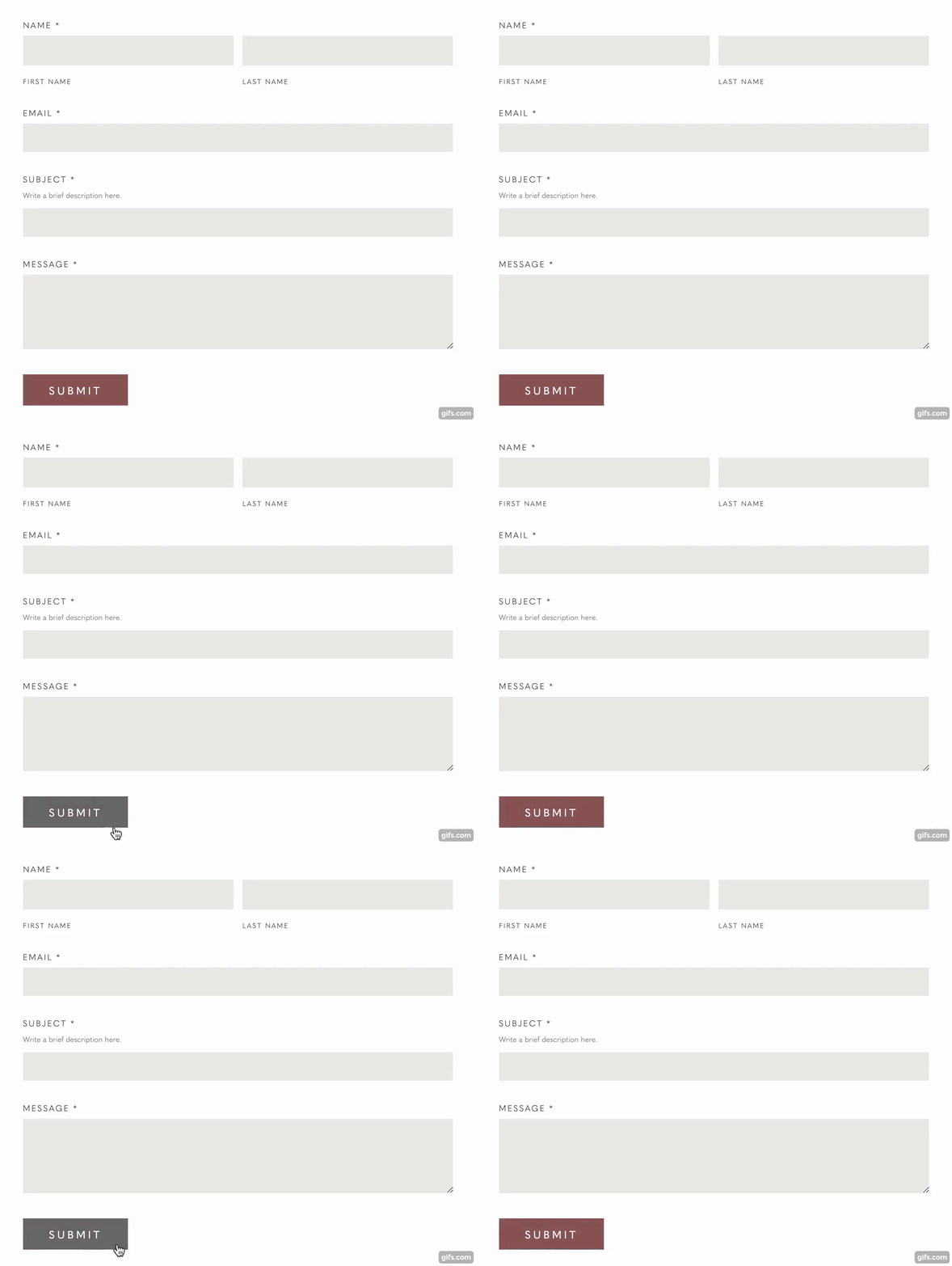
You can also create a hover effect on the form submission button. For example, let’s say you want to change the color of the button on hover. Here’s the code you would use.
.form-wrapper input[type=submit] {
  transition: all .6s ease 0s !important;
}

.form-wrapper input[type=submit]:hover {
  background-color: #515151;
}
The first snippet adds a smooth transition effect while the second snippet changes the color of the button on hover.
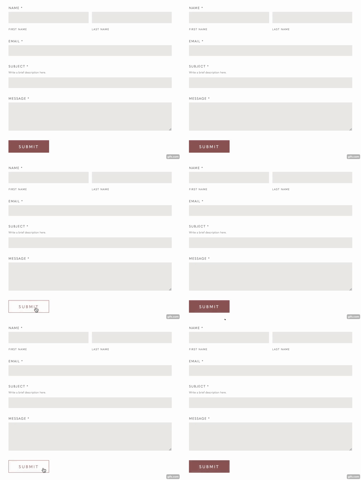
You can also change the style of the button on hover. For example, let’s say you have a solid button but you want it to change to an outline on hover. Here’s the code you would use.
.form-wrapper input[type=submit] {
  border: 1px solid #98635D;
  transition: all .6s ease 0s!important;
}

.form-wrapper input[type=submit]:hover {
  color: #98635D !important;
  background-color: #ffffff !important;
}
The first snippet of code establishes the outline so that the button doesn’t change size when hovered over and adds a smooth transition effect. The second snippet changes the color of the text and button on hover.
That’s it! You can customize this code to your heart’s content.
Did you find this tutorial helpful? You can leave a tip to say thanks!
Like this post? Pin it on Pinterest!

